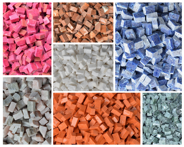
Mosaic design, an ancient art form that has decorated everything from Roman villas to modern-day spas, has a secret language hidden in its array of tesserae: the language of color psychology. When we gaze upon a stunning piece of mosaic art, we're not just admiring its intricate pattern or the skill of its creation—we're experiencing an emotional communication that reaches into our subconscious through color.
In this post, we'll explore how specific colors within mosaic designs can evoke different moods, feelings, and atmospheres, enhancing the visual storytelling of the piece. By understanding the psychological impact of colors, both artists and admirers of mosaic art can gain a deeper appreciation for this timeless craft.
Red in Mosaic Design
Red, the color of passion and energy, is dominant when used in mosaic art. It draws immediate attention and is often associated with love, power, and importance. In the realm of mosaic design, red can deliver a sense of warmth and vitality to a space, but must be used sparingly to avoid overpowering the senses.
A Touch of Blue
Blue brings an immediate sense of calm and serenity to any mosaic design. This color is universally beloved and represents trust, loyalty, and wisdom. Blue mosaics can transport the viewer to a tranquil ocean or a clear sky. It is ideal for creating an oasis of peace in spaces meant for relaxation.
Green: The Color of Balance
In mosaic art, green bridges the natural world with human creativity. It is the hue of balance, growth, and renewal—a nod to nature's abundance. A green mosaic could enliven a space with its organic overtones, promoting a sense of restfulness and harmony.
Yellow: The Hue of Happiness
Yellow, the most cheerful in the color palette, can infuse any mosaic design with a burst of sunshine and optimism. This color stimulates mental processes and generates a welcoming, energetic atmosphere. Yellow accents within a mosaic can uplift the spirit and invigorate the soul.
The Neutrality of White and Black
White and black play crucial roles in mosaic design, often serving as a canvas that emphasizes the vibrancy of accompanying colors. White represents purity and simplicity, offering a clean backdrop that makes other colors pop. Black, on the other hand, provides depth and contrast, grounding the artwork and accentuating the intensity of other hues.
Incorporating these specific colors into mosaic art requires a balance of intention and intuition. Every color decision impacts the emotional tone of the piece, with each hue contributing a unique psychological note to the mosaic's melody.
From fiery reds to calming blues, green growths, sunny yellows, royal purples, and stark whites and blacks, understanding the psychology of colors helps us appreciate the depth and emotion conveyed in every piece. Now, whenever you come across mosaic designs, you'll not only witness artistry in technique but also appreciate the silent language of color at work.
Browse our mosaic collection to brighten your life with colorful art and adorn your space with a shade that most resonates with you!


