Thinking colors for your mosaic designs

The human brain is a complex mystery, privy to a vast myriad of feelings and emotions. And in a transformative world, the human eye – quick shifting and wondrous – is wide open to absorbing more than 10 million variations of color.
When scrutinizing any art form, whether award-winning masterpiece, undiscovered relic or self-made creation, colors are the core essence of the visual experience. Mosaic tiles, colored glass or any material of choice will serve to beautify a space boldly. But this is a question of being choosy with your colors, to allow the mosaic to enjoy fluid dialogue with its surroundings.
In this blog post, we touch on some of the psychological effects that colors have while going across the spectrum.
We hope these illuminations will aid you in zoning in on an ideal mosaic of choice.
RED
Instantly equated with passion, red is a double-edged sword, tending towards feelings of extreme affection and outright rage. Quoting the cliché that love is hate is perceiving red in its absolute value. Red has to it a very impacting double definition that is relegated to a special place in our minds.
While we’re all guided by feelings of love or passion if you will, red becomes a tricky area in how it communicates with its surroundings. It mirrors powerful sentiments while casting a dominant glow that cannot be overlooked. With two faces to the same coin, it is a primary color from which many others are sourced.
Certain shades of red can make a person’s blood boil, if cast against a black backdrop. Red can also reflect feelings of dominance and power. A pastel red can announce the early days of spring. As devastating as it is empowering, be delicate when selecting your reds, especially when dealing with glass mosaics.
YELLOW
A popular and positive color that agrees openly with its surroundings, yellow inspires optimism and stimulates feelings of vitality. The light-infused color promotes feelings of confidence and has to it a restorative effect when interspersed in the right way. Like any color, if overused, it can have adverse effect, like instilling feelings of anxiety or expressing danger.
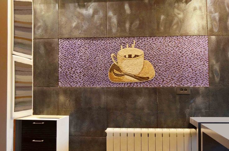
Yellow is not considered a pacifying color, and can enervate if not used in the right way. It has the appeal of a sunny sky, but has also been proven to make babies weep. Not advisable for an infant’s bedroom per se, one thing yellow definitely elevates is hunger, prompting us to put our taste buds to use. A kitchen or coffee area could use splashes of yellow.
A luminous color with a fresh aura, it promotes extroverted behavior so gels very well with areas that are designated for social interactions. Prone to lift spirits, yellow is a great addition that keeps everything pristine and fresh.

GREEN
When you think meadows or flowing fields, you think green. But what is assumed to be the color of life is also commonly perceived to be the color of greed and envy. As mother nature’s most preferred color of choice in a widely expansive and encompassing eco-system, green keeps you warm in its embrace. It extends its arm out to wrap around the planet with its many varying hues.
Green has a pacifying effect on the observer, promoting feelings of rejuvenation and inner peace. Natural is the word. But when drooling into a negative territory, green can imply blandness and feeling unwell.
Green as a color demands very little from the eye with its refractions of light because it lies in the center of the spectrum. It is categorized as a highly restful color, and inspires feelings of equilibrium and balance. Green holds you in its embrace and encourages composure. It is a staple choice for military fatigue, owing to its ability to camouflage. Think chameleon.

BLUE
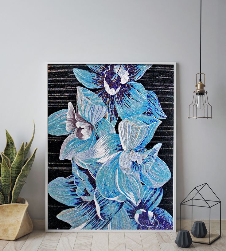
Blue, as opposed to red’s rash qualities, is everybody’s companion, in being a very soothing color that incites nature and creation. A cool and collected color that inspires focus and concentration, it is associated with feelings of calm and serenity.
Blue does well to promote a free-thinking environment as it also inspires trust and has to it a very soothing effect on our mind. But blue also has the propensity to impact negatively on its surroundings as it also symbolizes the cold.
The ocean is a vast and open place with hidden treasures, but it’s also a murky depth that can swallow you whole. As it stands, blue is often considered to be the most popular color amongst many. It is a good element with which to manipulate proportions seeing as blue objects often appear further away than red ones. Blue also tends to lend a neutralizing effect to its surroundings. But when taken overboard, this can be perceived as lacking in emotion.

VIOLET
Also the name of a flower, this color is indeed a shrinking violet in itself. A shy color, if overused, violet will not be inviting and even appear borderline strange. In moderation, violet imparts feelings of royalty, luxury and opulence. But when taken to a different extreme, violet can come off as a highly anti-social color.
It constitutes the shortest wavelength in the color spectrum of all existing colors. Its glow can transform any space into a more personal environment by encouraging deep thought and contemplation. With its fantasy-like nature, violet is often associated with cosmology.
But while violet adds more substance and charm, it can also cheapen an environment with a vulgarizing effect. Inciting spirituality, it hikes up your awareness and can have to it a very levitating aura. Violet is popular amongst yogis and brings on a good vibe for meditational areas.

PINK
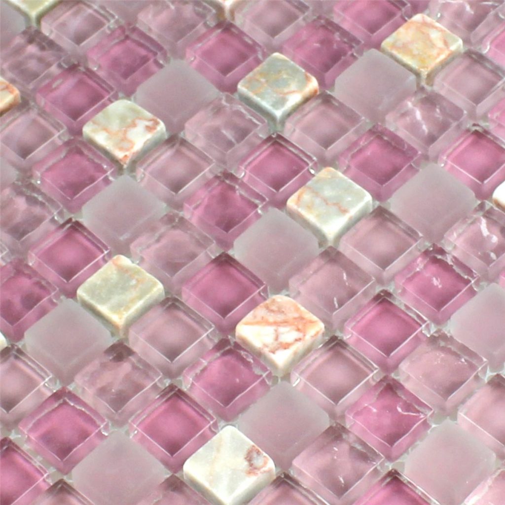
When you think pink, you are transported to an otherworldly territory with faintness of the heart. Pink is girly but it can also be flat-out strange and awkward if misused. But sometimes, that is the whole point, as long as there is an element of harmony.
As pink tends to polarize its environment towards feelings of the more feminine, it has a sensual quality. It announces feelings of progress and change, yet too much of it can conjure hostile emotions tending towards inhibition and all-around weakness.
Pink has a soothing effect on the mind, as opposed to other colors and is prone to stimulate. Universally seen as a color that represents the female gender, it can nurture its environs, but also drain its surroundings if overused. Be wary of how it settles in with your mosaic designs.

GREY
While through a surface observation grey mainly neutralizes, it also has the potential to bring on a positive mindset – albeit in a very subtle way. Its undertones are pleasant. But a flood of grey will suppress its surroundings to a strong degree, like the hues that gather overhead with terse weather.
Grey can put a damper on things so is better used in the background. It can imply a lack of confidence, as pure grey is said to have virtually no psychological effect on the mood. In being a color that mainly highlights a lack of color, it can also bring on feelings of despair. But if used minimally it will inspire hibernation-like impulses. Ideal for sleepy time.

BLACK
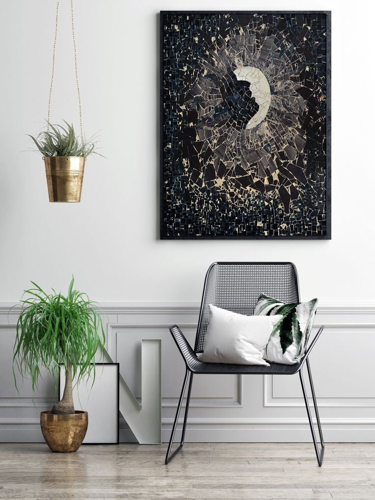
A sinister color that brings on feelings of both fear and security, black is also equated with classiness and sophistication. Black embellishes the colors that surround it, serving as a springboard for other colors to leap out at you.
Best used to take on a modest role in the artwork, too much black will mute the space out. As the absence of light, it has a significant effect on our psychological well-being. Black will beat you down and oppress you if not treated in the right way. But equally, it has the potential to bring you to emotional safety if kept in its place.
Like peering into a midnight sky, black will haunt you if left to thrive on its own. But it can also enchant you by highlighting the glitter of a star-studded sky.
A color that is heavy on the heart, it agrees with all other colors. Yet it can also easily overpower an environment if not tempered in the right way, or if combined with an equally harrowing color like red.

The psychology of color is fascinating, rooted in the enigma of our minds, with different variations inciting different emotions.
We hope this blog post colored in your imagination for when it comes to zoning in on the ideal mosaic design specific to what you have in mind.
For a plethora of mosaic designs, both pre-designed and customizable, please visit Mozaico for more.


